Express-O Café is a fictional local coffee shop in Cleveland that features an art gallery. The café specializes in organic and natural ingredients in their food and drinks. Two fonts are used for the café. Brush Script is used for titles and subheads to show the creative and artistic side of the café. Avenir is used for body copy to provide simplicity and readability. In the color palette, the brown represents the color of coffee beans, the blue is a pop of color to contrast against the brown, and the green represents the organic ingredients used for the food and beverages.
The logo shows the two sides of the café. The script font shows the artistic side of the gallery, and the sans serif font shows the business side of the café. The “E” and “X” in express are customized to exaggerate the curve of the script.
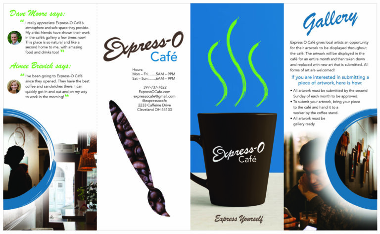
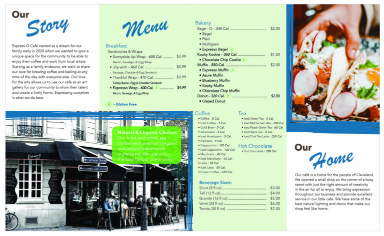
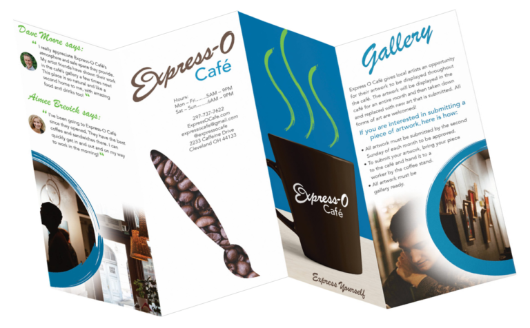
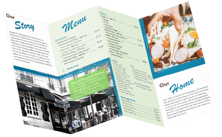
The brochure is a double gatefold. The front has the white logo over an image of hot coffee. The first fold talks about the art Express-O Café’s gallery. Inside the brochure, the left and the right side has the company’s story so people can read about how the café started. The middle of the brochure has the menu so people can know what the café has to offer. The back of the brochure has the business hours and contact information and a brush made of coffee beans. The paintbrush combines both the artistic and business side of the café.
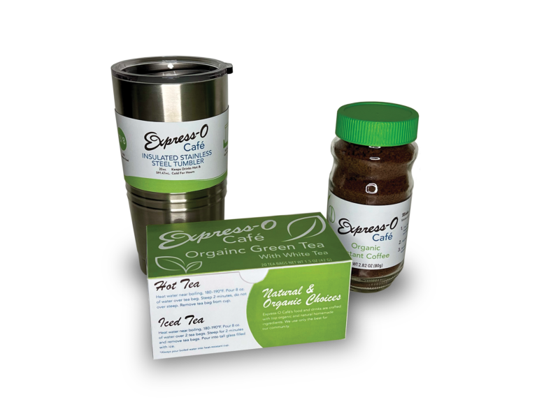
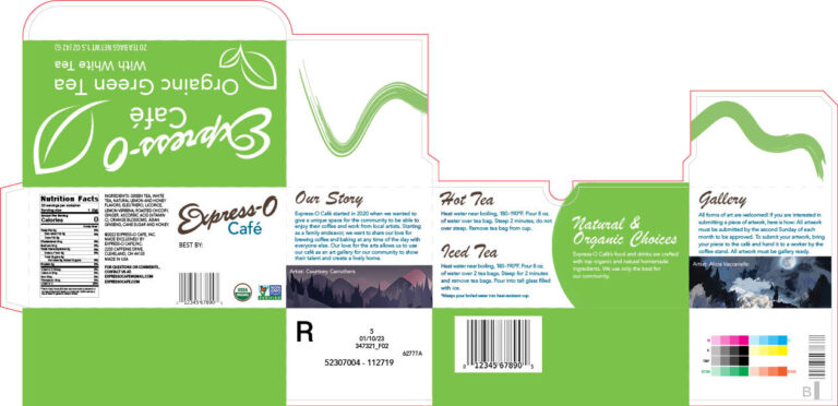
The packaging designs are for the instant coffee jar, green tea box, and tumbler. These packages represent each part of the company. The café’s theme is art, creativity, and expression. The instant coffee jar is designed to be easy to understand and go with the café’s theme. The design for the green tea box is to stand out against other packaging on the shelf and provides information about the café. The tumbler is designed to go along with the café’s theme and have all the information the customer may need about the product. Each packaging has the country of origin, declaration of responsibility, UPC, and declaration of product.
Brochure
Brochure Mockup
Packaging Dielines
