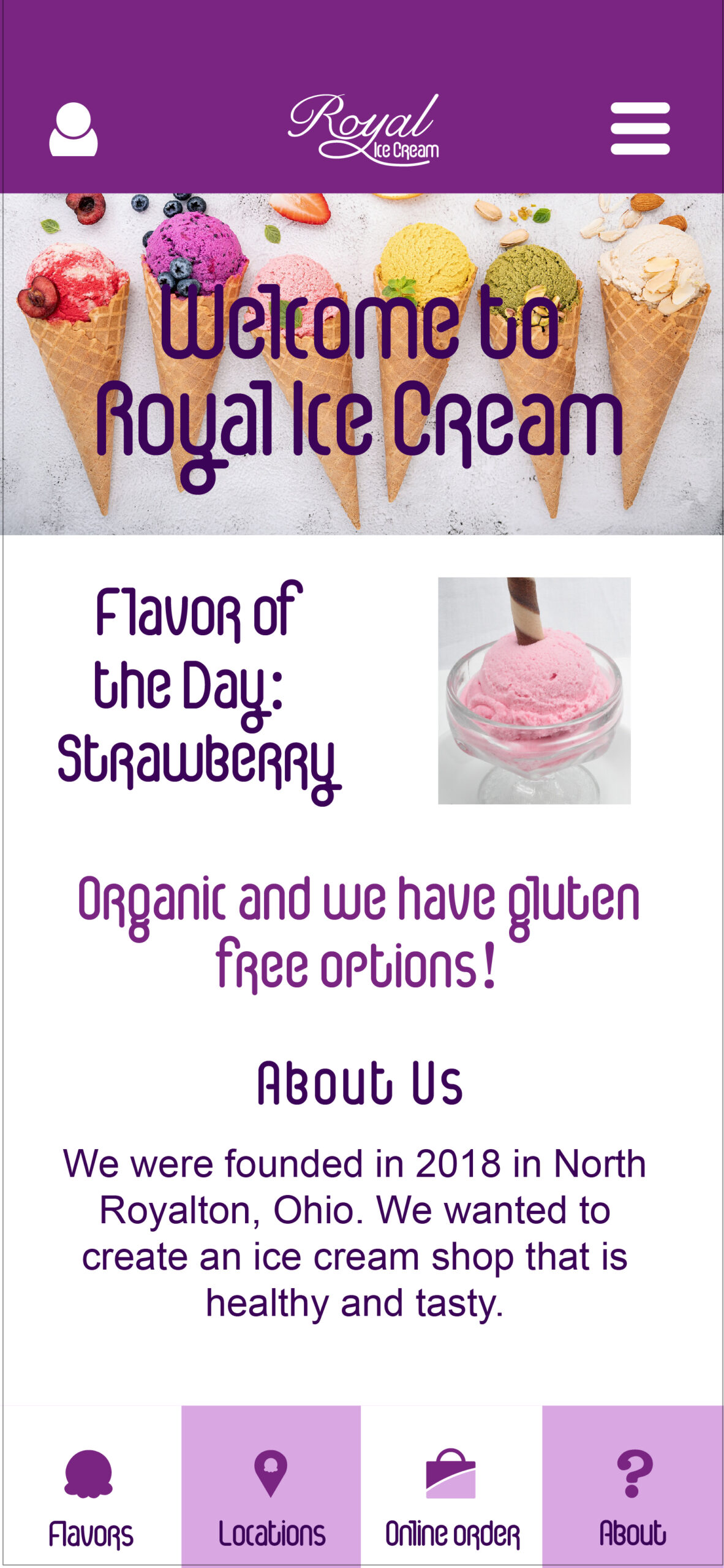
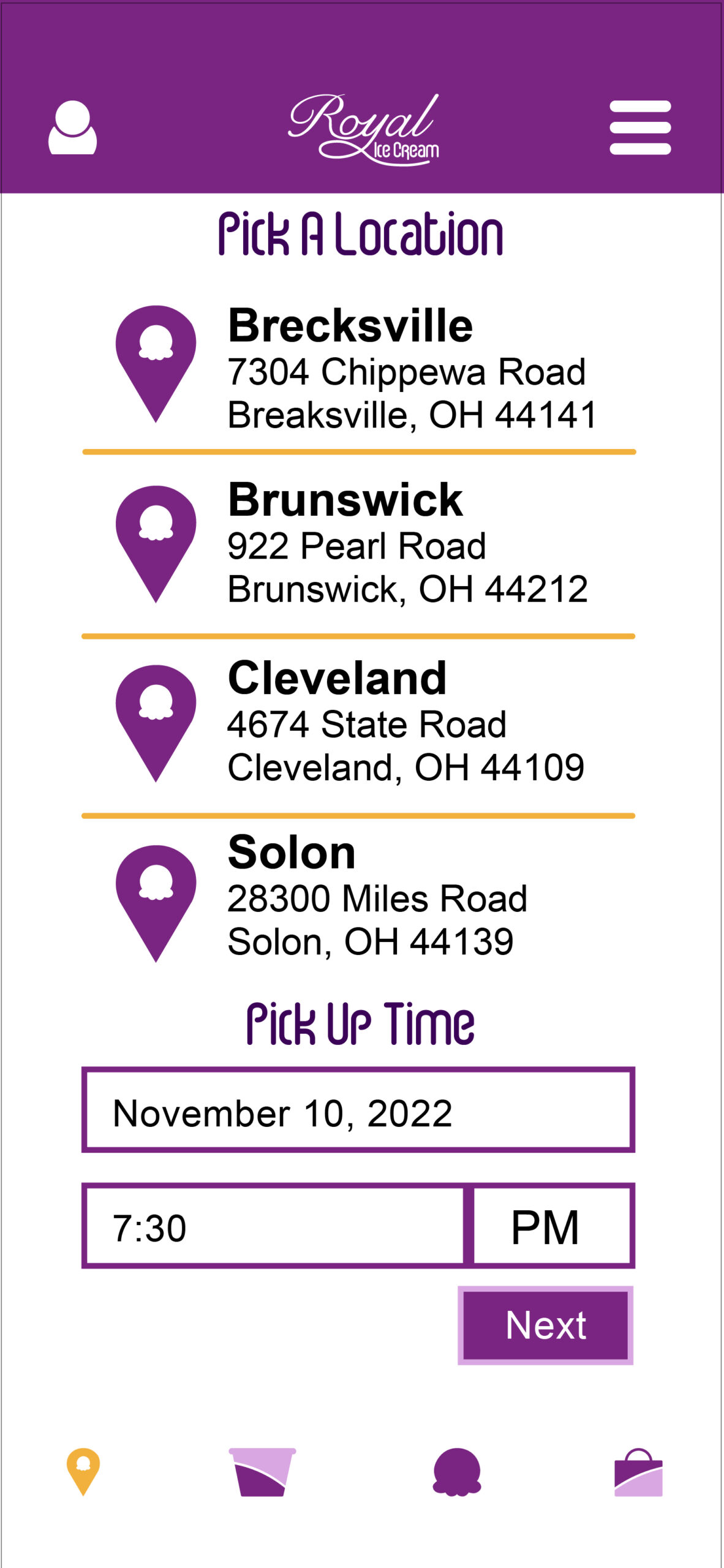
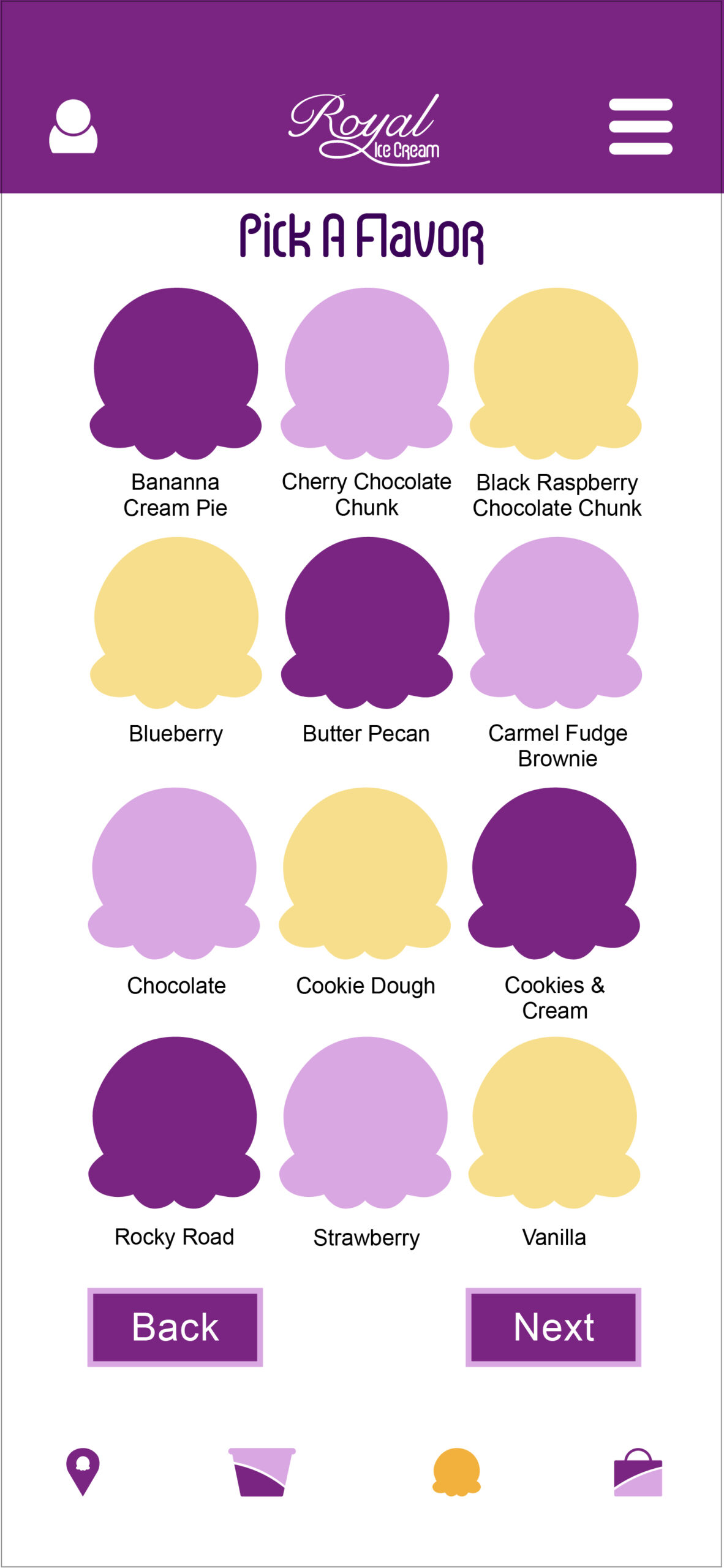
Royal Ice Cream is an ice cream shop with several locations across Northeast Ohio. They serve a variety of flavors, gluten-free options, and all their ingredients are organic.
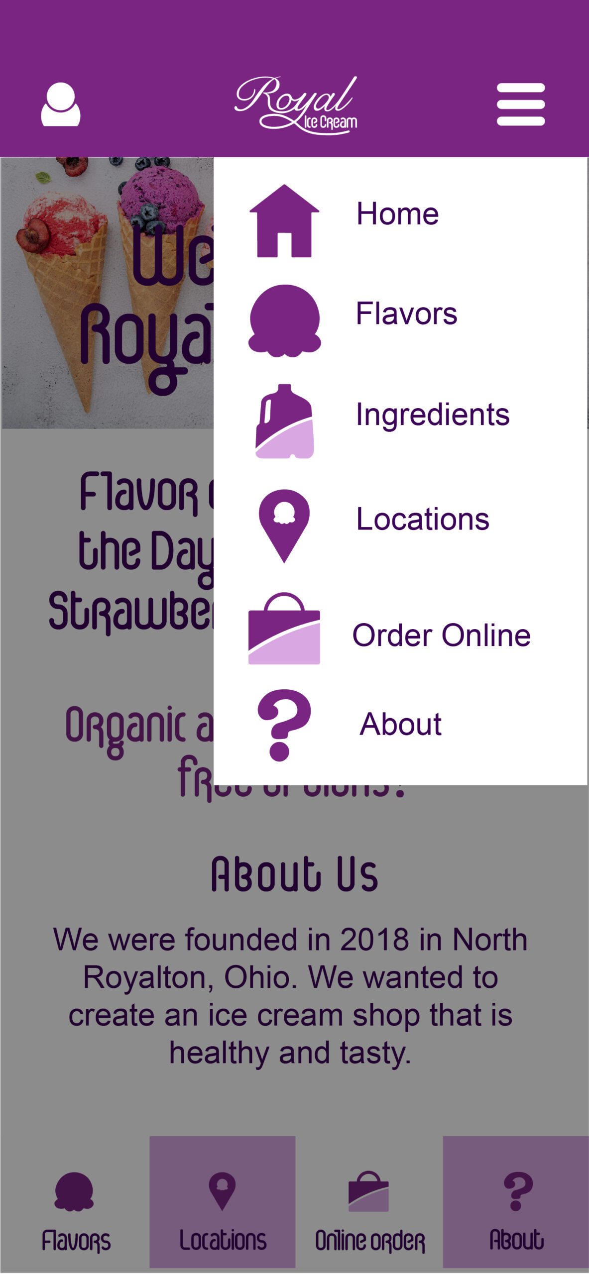
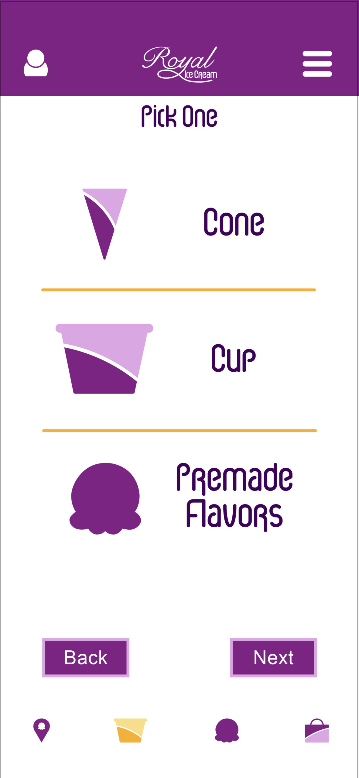
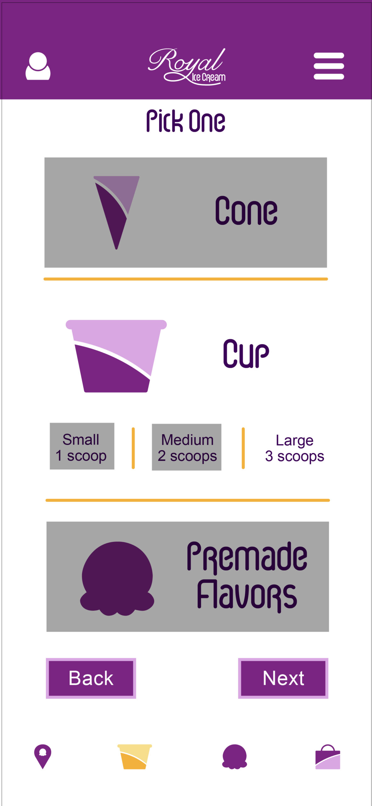
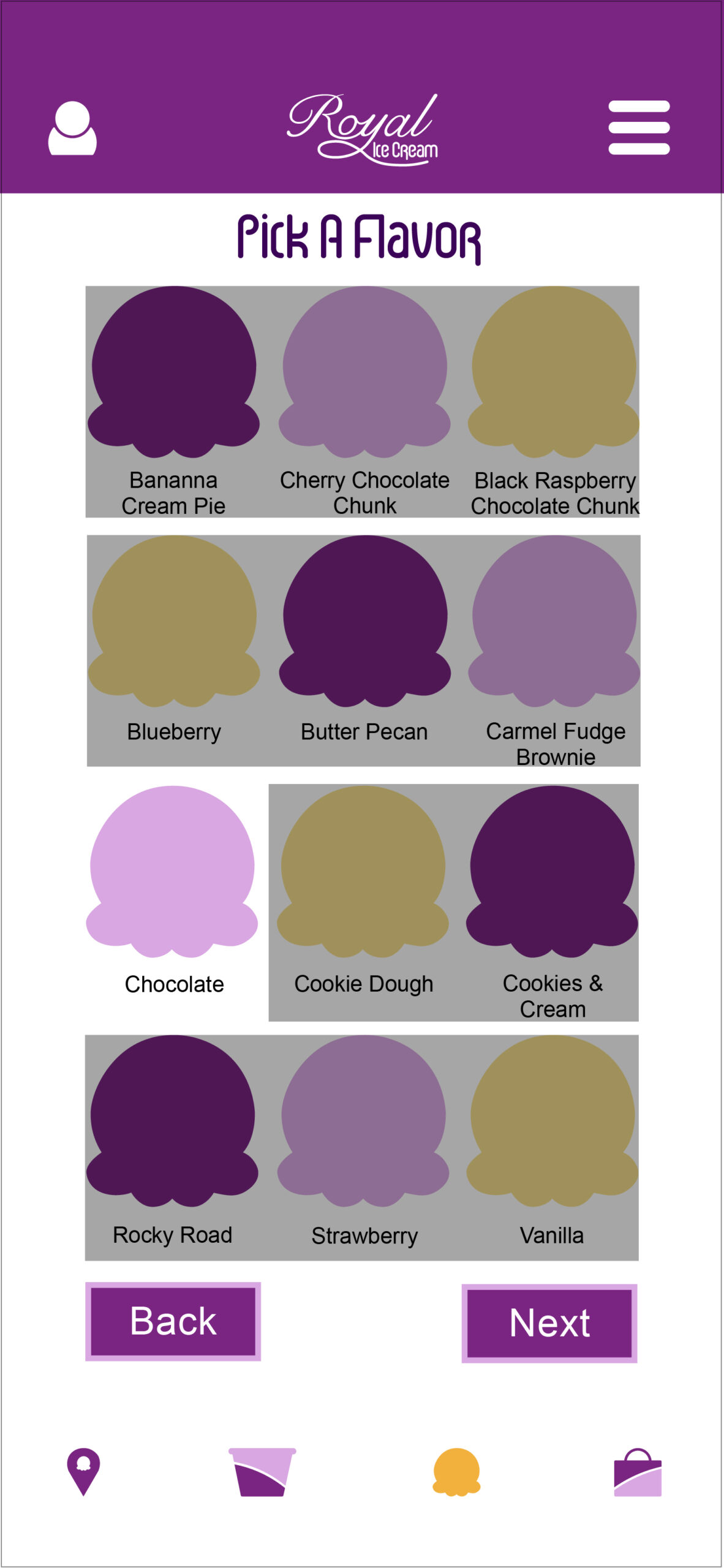
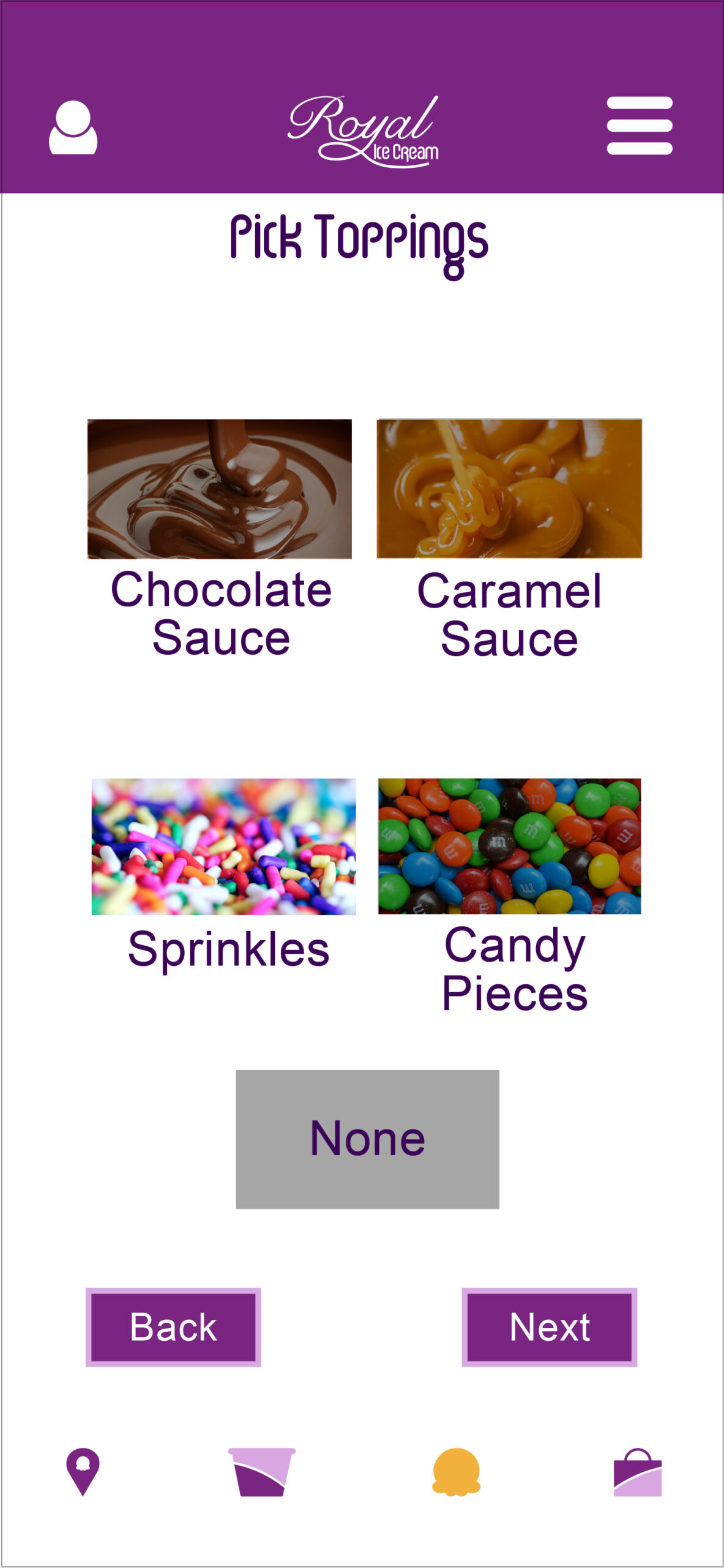
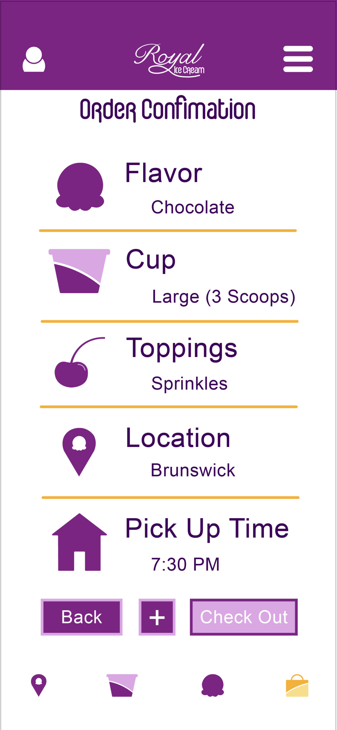
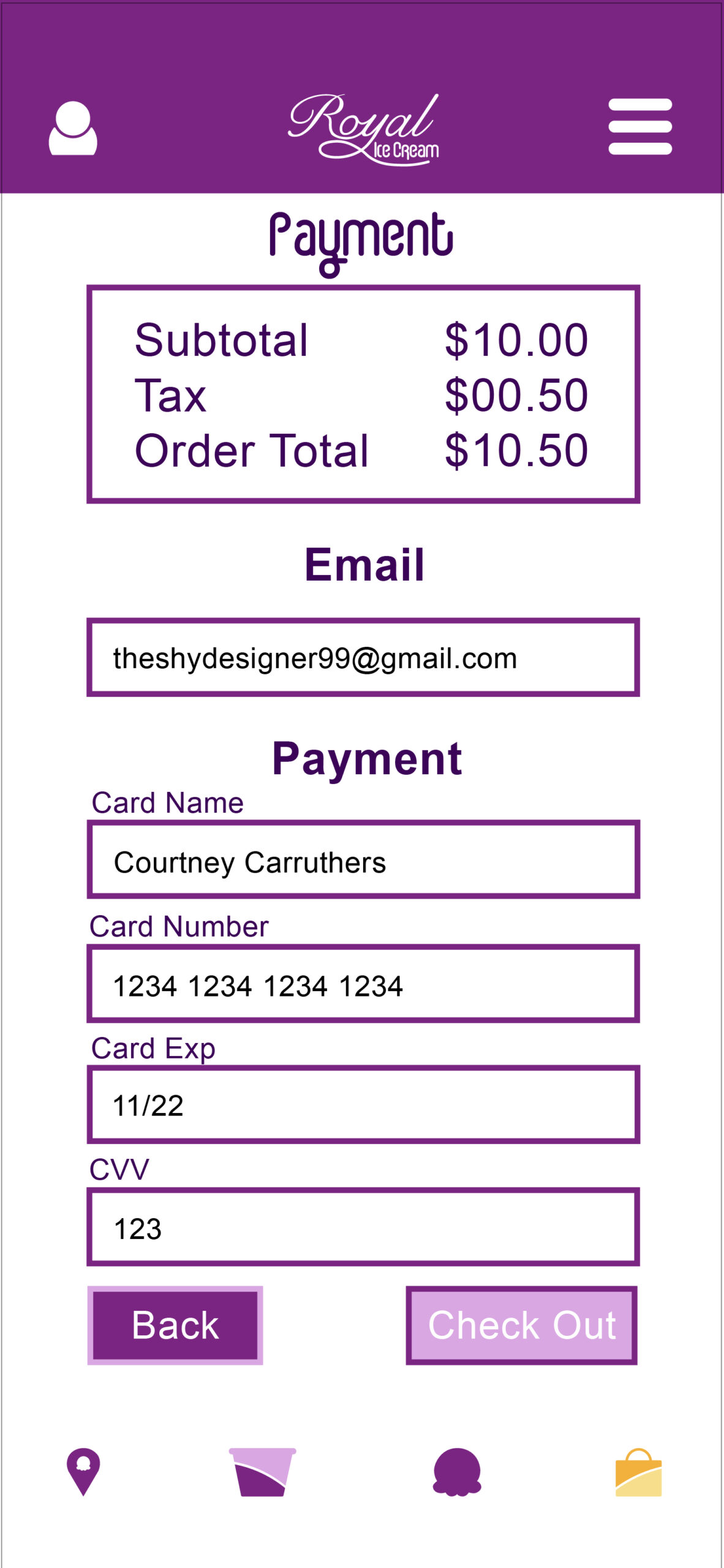
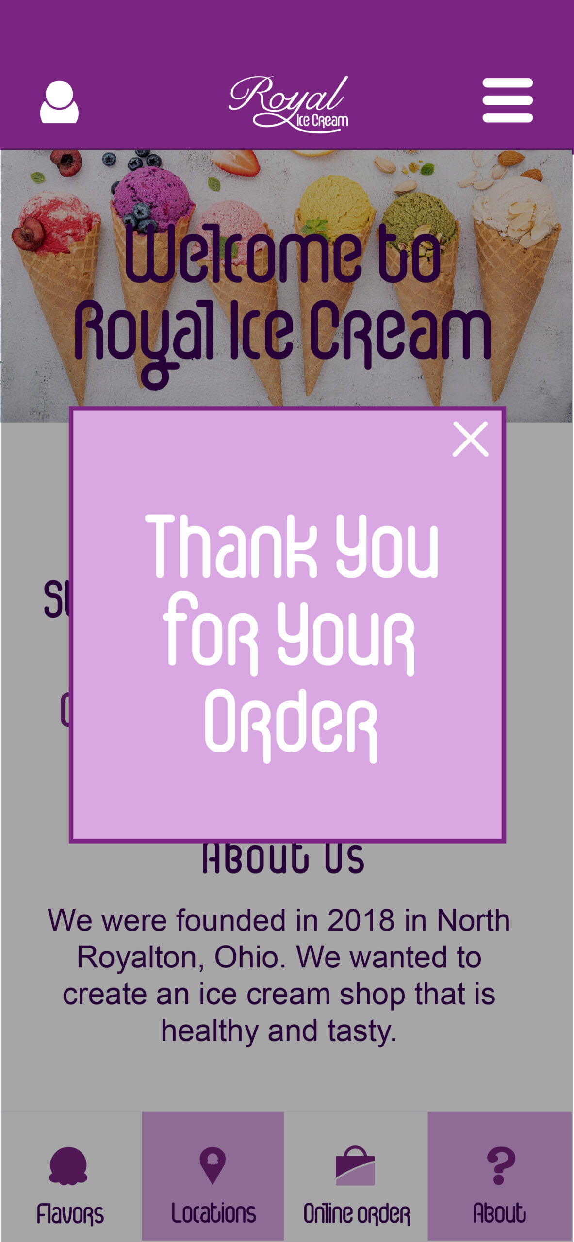
The typography for the app evokes a retro feel. Ice Cream Soda is used for headers and identity system to give a classic feel to the brand. Ariel is used for body copy to provide simplicity and readability. There are four colors in the color palette, dark purple, yellow gold, light purple, and light yellow represent the North Royalton city colors. The app’s layout is organized and easy to navigate and understand for all users. The demo for the app is to go and online order a large chocolate with sprinkles.
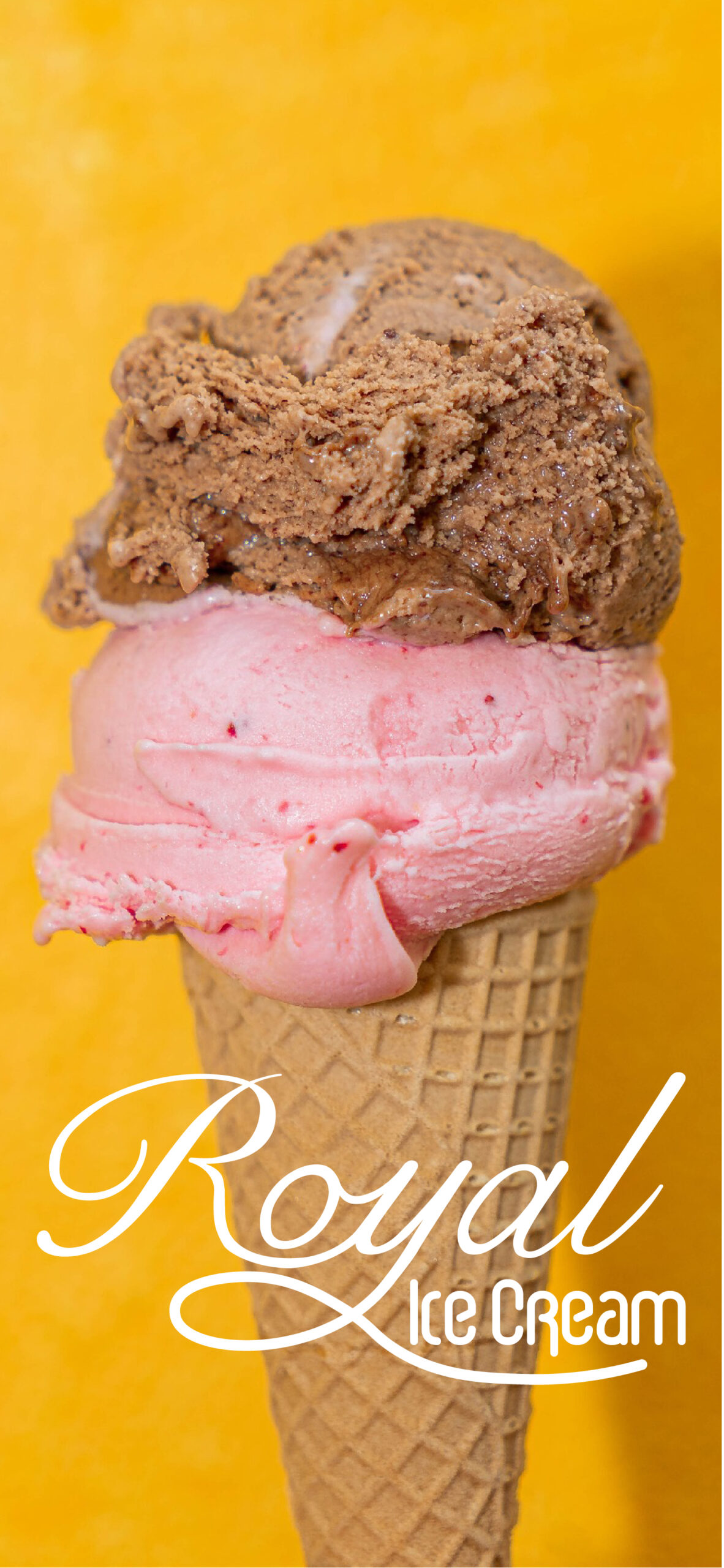
The logo uses the royal purple and the font for Royal is a script font that is edited to round the letters and extend the “y”. The font for ice cream is the retro ice cream font to show what the brand’s products are. The icons used throughout the app go with the brand and are simple and the user knows what they mean at first glance.